This guest post is by the Blog Tyrant.
The sidebar is the second most important place on your site. It is where, after engaging with your content, people head over to subscribe to your list, follow you on Twitter, or buy your product.
It is vital that you get it right.
In this post I am going to show you some of the web’s best sidebars, and then talk about how you can improve yours with a goal to get more subscribers and conversions, and make more money.
NOTE: You might also like the best About Us pages and the best Contact Us pages.
Criteria for a great sidebar
So what makes a sidebar great? Well, I have come up with a few criteria over the years but, of course, I would love to hear if you can think of any others.
- Above the fold: Do you know what I mean by above the fold? It’s everything you see before you scroll. Good sidebars have good stuff above the fold.
- Eye-catching, but not distracting: The sidebar needs to be eye-catching in that it gets people to interact, but not so much that people forget about your content.
- Takes readers deeper: The sidebar should take people deeper into your blog or site. It should get them to subscribe or convert them in some other way. That is the purpose of true navigation.
Of course there are more but these are the ones that really do it for me. After all, the whole purpose of the blog’s sidebar is to increase conversions.
The 10 best sidebars on the Web
Okay so let’s get into those sidebars. Here are the ones that I thought ticked the most boxes and really helped their users navigate their way towards a sale or a conversion, while still providing a fantastic user experience.
1. Tumblr Staff Blog
The Tumblr Staff blog is really cool because they show you the faces and personalities of everyone who works there.
Their sidebar is particularly useful because it advertises their product: Tumblr Blogs themselves. They give you a little form to start your own blog right there in the sidebar and then underneath have a very eye catching graphic on 30 reasons you will love their site.
This is a great combination—a sign up form and a list of reasons for why you should act. Might be a good idea for all blogs to explain to readers what they will get from signing up.
2. Copyblogger
Brian Clark of Copyblogger has totally redesigned his blog to appear more like a landing page that sends you off to his other products. The result? No sidebar. And that is something really brave and something that I had to include in this list
Sometimes the best thing you can do with a sidebar is get rid of it. If you are building a landing page that serves to get people to a sign up or purchase area, then a sidebar might just be distracting. Have a look at the way Copyblogger does things. It’s making money.
3. ViperChill
Pretty much everything that Glen does is amazing. He is a very talented guy. And his sidebars are simple but extremely effective.
The thing he does that I haven’t seen anyone else do is add testimonials from big players like newspapers and Fortune 500 companies talking about how good he is at what he does. This type of social proof really serves to solidify his brand and make him appear more authoritative.
4. Huffington Post
Huffington Post is the world’s most successful blog—it’s even listed on the Stock Exchange now. So following their lead is a very good idea.
In my previous post on the best comment areas we saw that they used badges and rewards to “level up” their readers and make them feel invested in the site.
The sidebar takes that idea further by showing readers what’s hot on Twitter, Facebook, and in other sections of the site itself. The net result would be that they get more social shares and a lot deeper user interaction with their content.
5. Mashable
Mashable is the biggest social media news site online. And they get that part of it really right.
One of the best things you can do with your sidebar is get your readers to engage with your Facebook and Twitter accounts, and Mashable does this by getting people to log in with their accounts. Then, they show those users which topics are trending. It is a very clever way to mix both the social outlets as well as the site’s content. The result? They get a lot of viral content.
6. Smart Passive Income
Pat is a super-nice guy, and his sidebar lets you know right away. The first thing you see is a picture of him with his young son.
This instantly builds trust with the new readers and, aside from building his personal brand equity, it makes you feel at home and in a very personal space. Pat then follows up by offering his free ebook below, as a natural progression from his little introduction.
7. Digital Photography School
Digital Photography School, Darren Rowse’s other blog, is a gold mine of “how to do it right” information. It is one of the best blogs for user engagement and has a wonderfully successful and active community.
The sidebar is perfectly done for encouraging users to get involved—how to make money, how to write guest posts, how to start a weekly assignment, etc. Useing your sidebar as an advertisement for different areas and functions of your site is very important.
8. Youtube
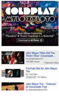
YouTube, after Facebook, has the highest page views of any site in the world. Last estimates I heard were around 30 pageviews per person. That means that, on average, every time someone visits YouTube they end up watching 30 videos! The reason? It’s the sidebar.
By showing people related content with enticing screen shots from the videos, YouTube gets users to dig deeper and stick around longer than they normally would. All this browsing makes it more likely users will see an advert and interact with it.
9. Facebook
For some reason people always overlook Facebook when it comes to discussing excellent website and blog ideas. I think it is because it just seems to big and impossible to mimic. But the way they have designed sidebars is extremely indicative of what we as bloggers should be doing on our blogs.
It shows insights into the page, what your friends are doing, and any important notifications. All of these things, when applied to a blog, can serve to really make your readers more addicted to your site. And aren’t we all addicted to Facebook?
10. Men with Pens
Like some of the others, Men With Pens uses its sidebar to promote the variety of services on offer.
One thing I really like about this sidebar is that it is totally consistent with the rest of the design. It goes a long way towards keeping the site true to its brand. But, as always, the best thing about James’s work here is the copy. The way the calls to action are written in this sidebar are second to none.
Which is your favorite?
Leave a comment and let me know which sidebar is your favorite. It doesn’t have to be one on this list, either; if you know a good sidebar that I’ve missed, please drop the URL below. Lastly, will you be changing anything in your sidebar as a result of this post? Let us know.
The Blog Tyrant is a 26 year old Australian guy who plays video games at lunch time and sells blogs for $20,000 a pop.


0 comments:
Post a Comment